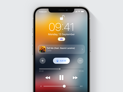
iOS Lock Screen Media Control 📱 - Concept
Hit L if you Like!
I love iOS, but I felt the Media Player on the Lock Screen felt out of place and needed improving. I couldn't quite put my finger on what it was until a few days ago, so I made this concept for an improved Media Player 😬
I began by analysing the existing Media Player. I also got feedback from other iOS users, friends as well as Reddit users, to confirm whether other had similar issues to those I had and discover other ones I may not have noticed. Here's what I found:
TLDR 🥱
⬩ Clearer indication of the device you're AirPlaying to
⬩ Larger buttons that are easier to tap
⬩ Add a song to your library straight from the lock screen
⬩ More options without having to open the Music App
⬩ Improved clarity of CTA elements
⬩ Two player sizes for different needs
⬩ Glide ability on AirPlay pop-up
Clearer indication of set AirPlay destination
I made it easier to tell which audio device iPhone is connected to and the name of the device. 🎧
Larger buttons that are easier to tap
I found that people would often be preoccupied with other things when changing songs and at times miss the button they were aiming for. Bigger buttons mean easier to tap and I also spread some buttons out a bit more to reduce the likeness of miss-taps due to proximity.
Add a song to your library from the lock screen
🚶When you’re on the go, taking your iPhone out, unlocking it and going to the Music app to tap the more button and Add a Song to Your Library can be cumbersome to do. Having the “Add to Library” button on the Lock Screen aims to make things easier 🍃
Indication the cover artwork is tappable and has action
Myself and a few others I asked didn't know that tapping the album artwork takes you to the music app 🖼 I made this action more obvious by making it feel like a UI element and adding a chevron arrow as as indicator. ➡️
Get more options without having to open the Music App
I added a more button that leads to a contextual menu. I added the “Love” and “Suggest Less” options into it. The aim is to increase user engagement with these actions through easier access resulting in Apple Music better understanding your taste.
I found that your fingers 👆🏼 would often cover the symbols of the Contextual menu so I changed them from the left-aligned to right aligned to help with that.
Two player sizes for different needs
Most of the feedback I received mentioned the player felt like it took up too much space. The Media Controllers UI’s style is very similar to a notification. It can’t be dismissed and it’s taller than notifications making it feel like a large and permanent notification in the way of everything 😶🌫️
Another issue is that users would accidentally tap buttons when holding their phones 🤳🏼 This is the complete opposite of what I was experiencing, but still common amongst feedback 💬 So I decide to add a mini player and serve both types of users. It cuts down to just the essentials, placing UI elements higher up the screen making them less reachable and therefore reducing accidental touches. I also reduced the size of the buttons while still keeping them fairly spaced so they don’t feel very difficult to tap.
It would also be useful to have the Driving Focus mode automatically trigger the larger player as I often struggle with the size of the controls when driving 🚗
Glide ability on AirPlay pop-up and a button to close it
The existing pop-up menu for AirPlay source felt a little strange. Spacing was odd. It isn't immediately clear which device you're AirPlaying to . The differentiation between the built in iPhone Speaker and external speakers would take a little brain power to figure it as well 🤔
I added a state change making it immediately apparent which device was being AirPlayed to. 🔊
I kept gliding in mind so you can easily hold the AirPlay button, and glide through your AirPlay options without having to raise your finger and tap again. Additionally this helps to reduce accidental taps. I added a close button because I noticed some people couldn't figure out how to close the pop-up ❌


