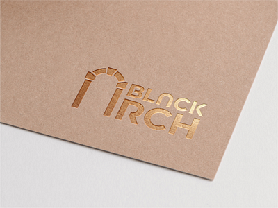
Logo for an architectural studio
The approved version of the logo, the original idea of which is an architectural arch instead of the first letter of the keyword. The client also liked the proportions of the first and second words 2x3. An interesting and unique font was also created for this logo. The main wish was minimalism and informational content. I think both have been achieved.
You can read more about me and my work here: <a href="https://www.behance.net/pechonkin_design" rel="nofollow noreferrer">Behance</a> | <a href="https://www.instagram.com/pechonkin.design/" rel="nofollow noreferrer">Instagram</a>
Quick links to contact me:
WhatsApp https://wa.me/+380932157763
Telegram https://t.me/pechonkin_design
E-mail v.pechenkin@gmail.com
More by Vladimir Pechonkin View profile
Like
