Color Palette for a Skincare Brand
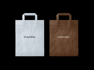

The brand name "Mandal" comes from Mandala - Tibetan-Buddhist drawings made of sand. Mandal is an innovative skincare brand founded in Rome, Italy. It is specialised in plastic-free personal care products with plant-based and plant-derived ingredients.
In order to address Mandal to the specific target group and successfully communicate its values, it was decided to avoid vivid contrasts and complex design elements in the brand identity. The brand's sustainable approach is communicated through the primary color palette consisting of soft blue and brown shades that are nature derived, and can be associated with watery and earthy elements. Both colors are muted what makes them look contemporary, exclusive, and unconventional. In terms of the psychological matter, blue shades are normally perceived as calm, reliable, and stable, while the light version of that shade adds some elegance to the visual perception.
See the whole project on our Behance: https://www.behance.net/gallery/120065699/Mandal-Brand-Identity
Read the client's review in "Reviews" on our Instagram: https://www.instagram.com/katezest.studio/?hl=en
_____________
For inquiries: contact@katezest.com
