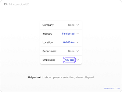
Accordion UI design helper text
Heya! Roman's here.
I am a UI designer, maker, and seller. It's been already 3+ years passed since I started to make templates for Figma and founded Setproduct.com to help startups and individuals save on design and release faster.
Working for 20+ years in graphic design, last years I've been browsing thousands of apps, screens, components, and layouts almost DAILY to gather the most complete ebook of how to design components, templates, and entire apps.
Fortunately, I've started with the 1st chapter related to the State of Avatar. Glad I was listed on some popular design resources and got a bunch of retweets and mentions. Which makes me decide to continue my explorations.
What is Accordion component?
Accordion (aka Expansion panel) — is a vertically stacked list of options that can expand/collapse to reveal or hide more associated content.
Continue reading 👉 https://setproduct.com/blog/accordion-ui-design
Duplicate Accordions for Figma 👇 https://www.figma.com/community/file/1016698019619294454


