Deburnay's Dance Centre - Classy Redline – Concept 3
Dynamic/Loud
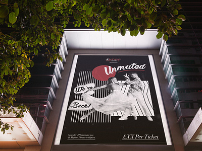
A photo of two dancers has been cut out from the background to which allows the viewer to focus on the dancers making it clear that this poster is for a dance show.
Using Deburnay’s brand colours in the photography and graphics reinforces the branding on the poster, so somebody that is familiar with Deburnay’s will instantly recognise this poster as for a Deburnay’s show. The poster has been visually layered with graphics which help bring the dancers into the foreground.
The graphics themselves are black and white creating high contrast and make the image have a visually loud quality making the poster very striking and unmissable. For the title, I have used a more elegant brush script again selected for its human qualities echoing that this is a personal show, the brush script is contrasted against the serif typography which helps enhance the classy feel of the design.
