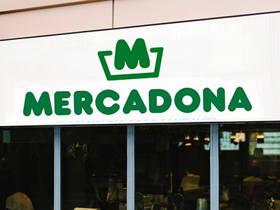
New Logo for Mercadona
A simpler and more recognisable logo for Mercadona supermarkets, maintaining the cart shape but using the M of the logotype as part of the logo. Logo colours palette is simplified to the iconic green and black or white as secondary color.
More by Paolo Falqui / BLØPA View profile
Like
