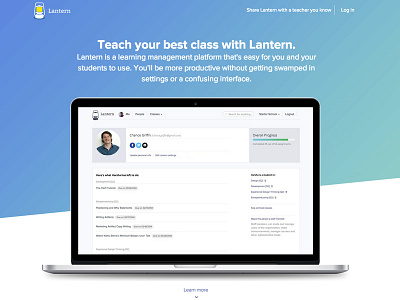
Lantern's landing page v2
After our first month collecting all sorts of metrics and running a few campaigns we realized that not enough people were reading and scrolling our current landing page (https://dribbble.com/shots/1497927-Lantern-s-landing-page-V1?list=users&offset=2).
With this new version our goal was to give the user a quick demo about the app (using screenshots and animated gifs) and make the user scroll and stay longer on the page.
More by Daniel Lopes View profile
Like

