Daily UI 024 - Boarding Pass
Challenge 024: Design a boarding pass. Consider the origin, the destination, gates, seats, the airline, etc. (As always, it's up to you!)
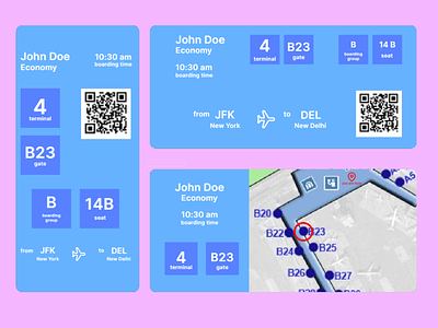
For this challenge, I chose to go with a simple, streamlined approach to the usually cluttered boarding passes. All of the important information is already determined, including personal info; flight info; and boarding information. This challenge's difficulty stems from item and info placement.
For portrait mode:
I wanted the screen to read like a book, personal information at the top like a title with more relevant information front and center. Boarding Time has its own section at the top because most users will check on it before entering the airport and a few times to double check their time when they're already at or near their gate. It is not as relevant as the rest of the information on screen.
When physically entering an airport for a flight, the user must first find the terminal and gate after going through security, which is why terminal and gate are at the center of the screen. From there, boarding group and seat are not as important, since those are items that are only relevant after the user has arrived at their terminal and gate. A QR code is adjacent to the terminal icon to allow the ticket to be scanned.
For landscape mode:
I went with a simple approach of placing all relevant information at the top right of the screen. Instead of relying on the fact that users typically focus on the center of a screen first like with portrait mode, I used Gestalt's Law of Proximity to show relevant information.
This prototype was made in Framer.
