Treyarch Logo Redesign
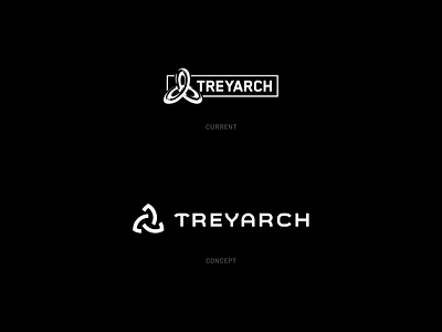
Hey Dribbbz! I took some time redesigning the Treyarch logo for fun. Simplified the mark to be more clean while still retaining it's symbolic triquetra. Also spent some time creating a unique custom logotype as well. Special thanks to Gabe for the help with the type. What do y'all think?
More by Dennis Pasyuk View profile
Services by Dennis Pasyuk
Like


