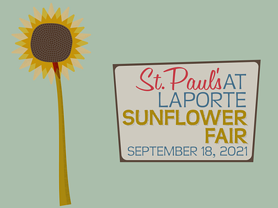
Sunflower Fair
By the use of the patterns to add texture and dimension along with the colors for the church this graphic came out to be "crafty country". The same font was used an alternative way to stylize the church's name (as seen in other projects). These are a few element for promoting the church at the fair. When designing print and digital media other similar skewed shapes were created with the brown borer and the rounded ivory inset to house more information.
The front doors of the church are on the same street as the fair. The church as participated it the fair in the past and has decided to do so again.
More by Mike Konieczny View profile
Like
