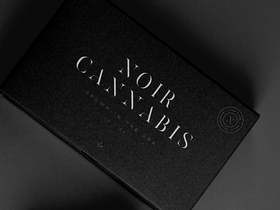
Noir Cannabis Logo Design / Package Design
Noir Cannabis, packaging and logo design. I wanted to create a brand identity that was a more subtle for the cannabis industry. A lot of packaging is loud, or uses the pot leaf in an in your face way, for this I wanted it to feel like a high end product you could take anywhere. With the name, Noir, the logotype has a lot of breathing room between characters to give it a classical / timeless look and can exist on pretty much any background. I also made a seal with the N to go on the business card as well as the package designs.
More by Kevin Craft View profile
Like


