Anonymization of documents - web app
My job was to design a web application, that would take a client through a process of anonymizing documents. Simple load of documents, then a form with input fields for data, that would search for this info in the documents and cover them with black color, rendering them unreadable. Afterward a simple view of the documents that have been processed and the option to download them.
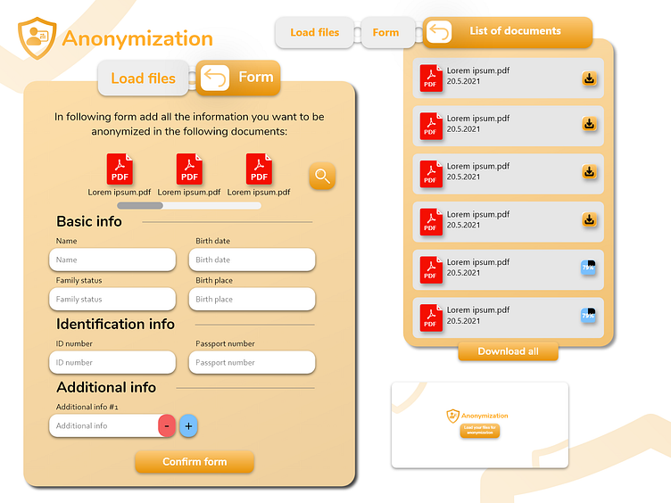
I took a simple and minimalistic approach right from the beginning and the landing screen is simple yet I think obvious, white page with a logo and button that says "Load your files for anonymization". (It's illustrated in the right bottom corner of the visual)
Loading documents is done as regular on any PC, just simple pop-up default file selection.
The next step is the form. Here I tried to make a form that would look like one on the actual paper that you would get anywhere, depends on the level of bureaucracy in your country. At the top, there is a description of this area and a list of files, that have got selected at the beginning. Underneath those files is a scroll bar, if there are more files then the screen is capable of aesthetically showing and button on the right which will show all files in a pop-up window, where you wouldn't have to scroll. (Unless you uploaded more than, let's say 15 files then I would add sliding horizontal pages to look through all your files, in that pop-up window.) The scroll bar is mainly meant for mobile users, on a PC horizontal scroll is not a good idea. At least that's what I've heard and it makes sense. Basic input fields but with placeholder and label as well are located further down. (Made that little mistake at first, when I used just a placeholder without the label above :D) At the very bottom is additional info, which serves as a bonus field area, where you can add as much other info as you'd like. Plus and minus sign adds or removes those fields, I think I made that pretty obvious.
After confirming the files, which will go through the anonymizing process in the background, the final screen will appear with the list of documents. All of them will be shown here with the respective progress icon, which will show the percentage of anonymizing completion or an option to download the respective file.
I focused on the theory of breadcrumbs and simplicity to make the navigation through the whole process easier. You can return to the previous screen by clicking on that back arrow or use the direct approach and select the specific screen. You could have done all those things on one page, which could make the entire process less mouse clicky, but I've chosen this approach.
Tell me your thoughts or opinions in the comments. :) Don't hesitate to ask any questions, hope I entered all the necessary information for you to recreate the entire process in your head.
If you made it this far in the reading, I wish you a great day full of inspiration. These several minutes of thinking and reading my content are lost forever :D, but I hope you enjoyed it and maybe even got something out of it.
Thank you again. :) Mato
