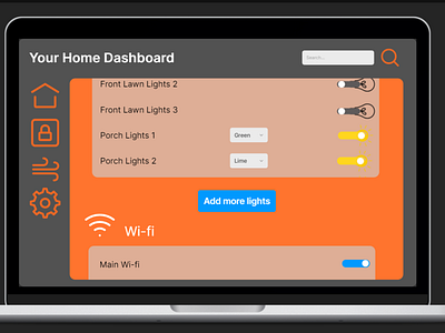
Daily UI 021 - Home Monitoring Dashboard
Challenge 021: Design a home monitoring dashboard. Be creative! What would make a dashboard visually appealing and fun to use, while also being mindful of the data? Try to make it a realistic exercise as if it were your own dashboard... one that you need to refer to daily. What is the most relevant data and what's the most appropriate placement for it?
For this challenge, I created a similar experience to my Daily 007 challenge: Making a Settings Menu. I provided a side bar to act as the main navigation menu with different tabs; different sections for each tab; and a search bar at the top for easy access. Most options were toggles wherever possible. I chose to go with a simple color combination, which can be modified by the user in the settings tab. The rest of my thought process is also based off of my Setting Menu challenge, which can be found here: https://dribbble.com/shots/16308534-Daily-UI-007-Settings.
This prototype was made in Framer. A link to it can be found here: https://framer.com/share/UI-Challenges--449hH1kqdlS7pKYoPutN/FTwGAaHwx
