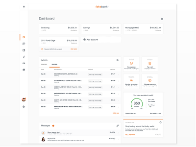
Dashboard concept
This concept was created to address some issues that existed from a legacy product. The previous dashboard lacked a lot of visual weight and became very list heavy. The common customer complaint was around the navigation, and the challenges with finding the right thing. The information displayed at times wasn't super useful.
The update addressed the following as solutions:
• Streamline the navigation so it can handle the addition of future items
• Make call-to-actions more visual and helpful
• Add variations of list styling so information is more digestible and readable
More by Steph Hubka View profile
Like
