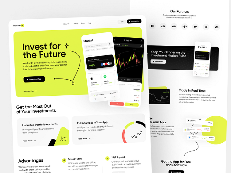
Profinance Landing Page Design
What a juicy yet simple, and comprehensive design of the Profinance landing page we made! We are moving beyond the standard color scheme, which is widely used in websites related to a financial topic. Bright green color highlights and accents important things. The black color adds contrast and confidence. And white is an ideal background to show the purity and minimalism of the company workflow.
Let's collaborate!
hi@conceptzilla.com
Discover more about us atconceptzilla.com
More by Shakuro View profile
Services by Conceptzilla
Like
