OneSignal Icon UI Color Optimization
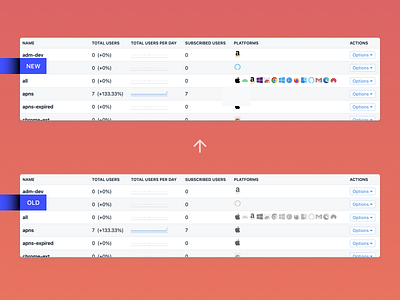
Worked with @charleskantz and @leemunroe on a quick update to the OneSignal table icon UI. It initially started from a problem we recognized with the Apple icons being grey making it difficult to understand if they were disabled or not. However we realized that the hover-effect in general was obsolete as well, as having the brand colors always active allowed a faster way to key into the brands each icon symbolized!
If you like it, don't hesitate to click "L" 💗 or "F"
Come build the future of notifications! We're hiring a Product Designer to help with all the day-to-day marketing communications to promote our messaging console used by 1 million app developers.
Apply at onesignal.com/careers