The Guardian home page
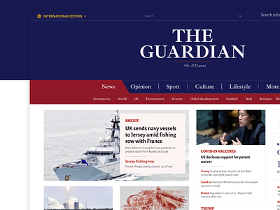
Design Challenge 4 / The Guardian home page
I am happy to share with you my version of TheGuardian.com. 📰
The news website is meant to inform, educate, guide and even entertain. It requires a clean and well-structured layout, which focuses on the content.
Compared to the original design, I added more whitespace. With the additional breathing room and the composition of the content, I made an easy to follow website that exhibits the information nicely.
I set my sights on designing a bit more modern but still classical solution and
using a readable and at a time compelling typography.
Hope you like it! Don't hesitate to comment.❤️
Get in touch
📧 nikolettililla@gmail.com