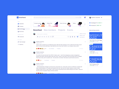
Company Social Intranet Main Page Version 2.0 2021
Hey! It’s a redo of my own old work from 2020 - https://dribbble.com/shots/14082881-Company-social-intranet-main-page
It’s been a year - I went from designing to product management position and haven’t done any personal cases ever since.
Real development of intranet changed my mind and my visual taste a lot. I have seen a bunch of references, worked with users, solved problems on frontend and backend and now I want less font styles, brighters screens, better contrast, better focus on main things. I want my eyes to feel easy and rest while looking at the screen. I hope you find this version enjoyable. Please comment and like!
I used:
1. EVA icons, free pack for personal use: https://akveo.github.io/eva-icons/#/
2. Illustrations from icons8.com, "Dizzy" pack, free PNG for personal use: https://icons8.com/illustrations/style--dizzy. Thanks a lot to the artists, Polina Golubeva (https://icons8.com/illustrations/author/5f32934501d0360017af905d) and Alexandra Manokhina (https://icons8.com/illustrations/author/607d4b1bfcae6a000d6d61bb)
3. The font is Inter, from Google Fonts. In particular I picked Inter Regular and Inter Semi Bold
4. Any personal data you find is mine :3
