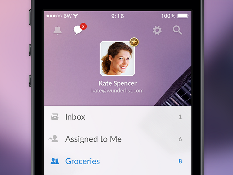
Wunderlist 3 - Home Screen
I present to you the Home Screen. The Home Screen, previously known as the sidebar on iOS has been completely reimagined and rebuild from the ground up.
Creating, editing and sharing your lists is now simpler and a lot more personal. We love our backgrounds and we realised in Wunderlist 2 they didn’t really get the spotlight they deserved. In Wunderlist 3, your background and avatar are now centre stage making Wunderlist more personal to you.
Excited for the launch? Check out our coming soon video and sign up to be the first to know when Wunderlist 3 is out.
More by Timothy Achumba View profile
Like
