Clean and Quirky
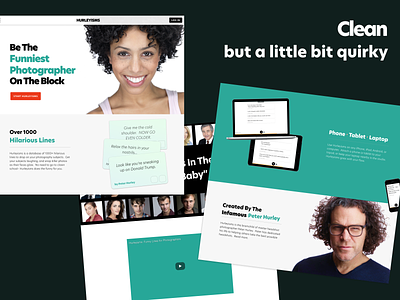
This was an assignment I did some time ago. The idea was to create a shot for a clean website with a hint of quirkiness.
Using vibrant colours and spacing between elements, I like to project an energizing and welcoming sentiment for the viewer.
More by Lucas Cumsille View profile
Like
