Simple Checkout Page

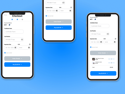
Simple Checkout Page, If I were to judge it harshly then I would say that is is a bit too simple. The header could be better I guess and the bottom area on the left and middle photos are kind of awkward. I think the body and the buttons are fine but nonetheless I think this is my third week of Learning Ui/Ux and my progress it going good.