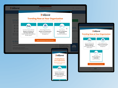
Tuition Manager Popup
Tuition Manager Popup
In this post, you can see the process I went through while designing the TuitionManager Popup. I started by wireframing my ideas and considering how to merge the Tuition Manager & Wiley Beyond styles. I focussed on three main user flows: three curated schools, select a degree, and a search box with filters. Below you will find a list of pros & cons that I shared with my team when presenting each option.
Option 1 | 3 Card Style
>3 Schools/Degrees are emphasized
>This design re-uses design elements from the Partners Page, so this will save dev time.
>There is potential to customize for each client's employees by location or degree type to capture the most likely matches.
>This option would be great for a client with employees looking for 1-3 types of degrees.
>Gives some partners an advantage/promotion. The schools could be switched out when in need of leads in order to fill quotas if that is how the partnership works.
Option 2 | Multi-Step Popup
>The user can "find the right partner school" with a degree selection placing an emphasis on how Wiley can help with the user's journey & finding the right fit for their career aspirations.
>This option would be great for a client with employees pursuing many different types of degrees.
>Does not give one partner an advantage over another.
Option 3 | Search Box/Dropdown
>Search By School and/or Location
>Allows employees to see a full list of partner schools & most likely choose one if there is brand name recognition or one nearby.
>Does not give one partner an advantage over another.
>Can add additional filters like online/inperson or 4 year vs 2 year
>Could re-use the search box somewhere on the website once it is dev'd.
Option 1 was the team's final choice.


