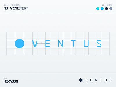
Ventus & Enhale Logos
What's up Dribbble community! I'm sharing Ventus & Enhale logos 🔵
I tried to give them a video game, sci-fi feel. I started with NB Architekt font as a base for typography. It helps because the font is monospace, and all letters were equal. What also helped is that the words 'Ventus' and 'Enhale' have the same number of characters which is pretty cool. It's essentially one logo if you look it that way!
I customized typography a bit by creating new letters for 'V' and 'A'. Then I took the bottom right corners of the letters and made them rounded for a bit more organic look. But my favorite part is the symbols. Hexagon and Triangle. Exactly the opposite in the number of angles. As Enhale is a sub-company for Ventus it turned out perfectly like the parent company gave a portion of its angles to it!
Typography and the symbol can be separated, used alone, one on top of the other, or almost in any way you want. Let me know what you think about these two guys. 🙌

