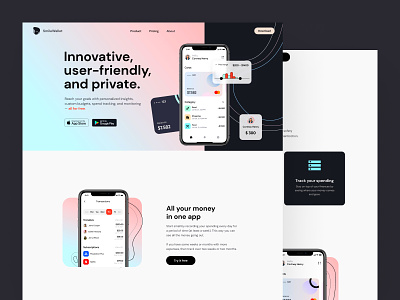
The Smilewallet landing page design
Hey all! Smile wallet — this wallet will make you smile. Financial planning is more than everything makes you feel safe and sure about tomorrow. So imagine a world where everything is in one place. There is no need to switch between online banking and your personal credit line score or spending app. When you said to people that something is user-friendly, they needed to check it themselves — that is why we spent four weeks testing the App with the focus group. We changed the UX 3 times, and once it becomes perfect, we laughed it with Max. But you know before the launch of an App, some marketing site needs to be delivered. So please meet one of my latest projects that I can share with you — The smile wallet landing page. Through the features and the App itself, we showed the client what is worth being announced and why they are different. What do you think about this style and general feeling? I need more feedback for you as well.
Thanks for staying active here.
Design — Figma
************
💌 I am open to new projects! hey@migulko.cz
************
