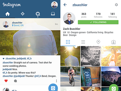
Instagram in Material Design
Woo! First shot!
I was stunned by the documentation that came out of Google during this year's I/O event and have been tinkering for a while now on a UI psd for myself (WIP). Decided to put together this mock of Instagram done according to the Material Design guidelines.
A few UX notes:
• The camera button is implemented as the floating action button, turning green while viewing the profile of someone you follow to indicate shooting in direct message mode.
• I've moved the Direct Message Inbox to the tab bar. It doesn't make sense to me that this one section lives in the top bar while the other sections of the app live in the bottom bar on the current app. Now all sections of the app that relate to communicating with other people are in one navigation scheme. Hopefully this also encourages exploration of this section of the app that I for one forget about because it lies outside the rest of the nav
• Profile is relegated to the top right corner, delivering you to a second section of the app that is all about you
• No nav drawer on the left because it's unnecessary and I don't understand hiding the actions you want people to take :)
Enjoy! And please grab the PSD.


