iOS homescreen wishful thinking
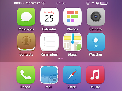

Just having fun with replacing iOS 7's extreme style with OS X Yosemite's subtle and warm one.
Tweaked the status bar a bit to make it less white-opaque.
Myriad. Myriad. Myriad. Or just any type which isn't Helvetica.
Also tried to group icon styles by their purpose - data-related are white with stacked pages, stores are oval-framed, media-related are white on vibrant colors - and everything is obviously using a non-mandatory grid :>
Checkout attached file for the rest of the icons.
Words are cool!