Escape Room Website
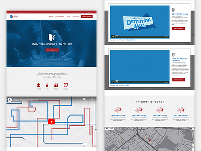
A website redesign for a client while working at Simon Studios.
My goal with the redesign was to improve the website's information scent. Users were also confused with the previous difficulty rating. The original rating was made of symbols that were variations of the brand's logo, and the level of difficulty was determined by the number of symbols up to five. For example, if an escape room had five symbols next to its difficulty it would signify that it was hard.
More by Carlos View profile
Like
