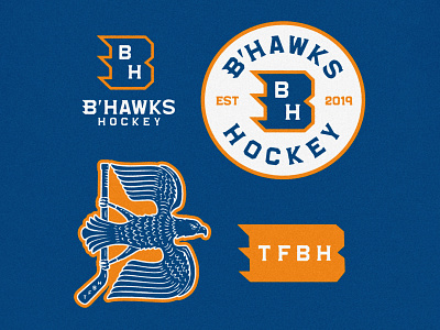
B'Hawks Hockey Logo
The B’Hawks were looking for a logo refresh to go along with their updated name. Formerly called the Brewhawks, the goal was to lose the beer references, and start fresh with a more fun and classic look.
I created a custom word mark, and monogram for their new logo, adding a sense of motion with the repetition of the winged B. We also explored some more illustrative styles, including the flying “B shaped” hawk.
More by Alexa Edgerton View profile
Like

