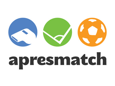
Logo concept #2
So after a first drop, here's a second shot.. changed the precedent font (Century Gothic) to more a bold one (MEgalopolis Extra)
The idea is still the same though, trying to visually 'suggest' soccer within an Ellipsis (yes! those three dots)
Synergie Media
Get in touch
More by Synergie Media View profile
Like

