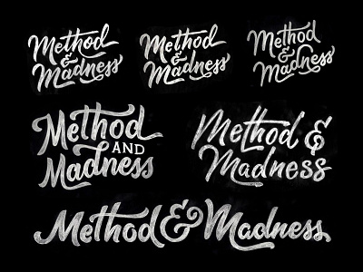
Method & Madness!
Here are a variety of hand-lettered logotypes for the Method & Madness Conference here in Phoenix (aka Phoenix Design Week).
All of these were drawn fairly large at an 8.5" by 11" size then scaled down for readability at smaller sizes. Still need to finish up the final vector logotype but I thought I'd share a bit of the process!
If you're in Phoenix, or nearby, come to Phoenix Design Week and hear me talk about stuff along with other rad speakers ;)
See you there!
More by Scott Biersack View profile
Like
