Lieferando Redesign
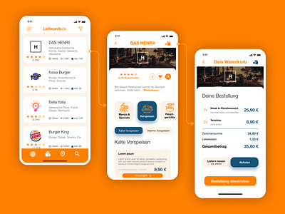
A little light weight redesign and a more graphical approach for navigating through the restaurant details page with specific icons and a better difference between main categories (with icon) and sub categories (text only).
More by Tony View profile
Like
