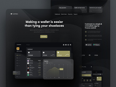
CashMate Finance Management Landing Page Design
The landing page for the financial management website looks powerful and magnetic, yeah? In this shot, we offer to rate the presentation of the final version of the CashMate landing page from 1 to 10. Comment, please! The screen looks strictly and thoroughly at the same time. We used muted colors - yellow, black, and dark gray for the website design, check out its dashboard design. The landing page looks light and mobile due to the barely noticeable transparency and blur effect we used.
Let's collaborate!
hi@conceptzilla.com
Discover more about us at conceptzilla.com
More by Conceptzilla View profile
Services by Conceptzilla
Like
