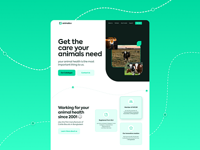
Animal Healthcare - Minimal Landing design
👋 Creative Brains!
I am super excited to share this clean and minimal website landing page design.
I have created this clean and minimal website design for an animal health care company.
This website design is based on minimalism and towards a greener, healthy, naturally made look. That's why I have used a soft-looking green color as the website's primary color.
👊 I have gone for a few rounded corners and lots of white space for the website's overall design. Besides, this used drop shadow in most UI elements, making the UI elements more poped towards the green color.
💬 Any feedback towards this website design UI will be highly appreciated and helpful for me.
💙 Press "L" if you like it and want to motivate this new designer 😍
More by Farhan Mubin 🌿 View profile
Like
