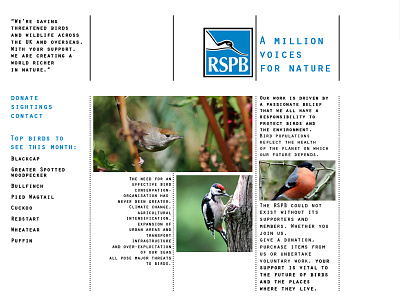
RSPB | Website Redesign
In this first year college project, we had to redesign a website of three choices, I chose the RSBP website, as this was the only one that included using both text and imagery. To make the project more challenging, we could only use templates based on other websites to be able to understand how we can save space, and ensure that headings and any banners included were given the essential space to avoid cramming too much onto one page.
To see the full project, be sure to head over to my Behance blog!
More by Karl Bembridge View profile
Like
