Material Design-ish?
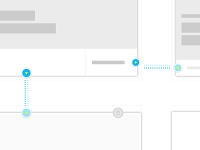

The site is designed to be navigated with swipes and arrow keys, depending on the device. The basic problem I am forseeing is lack of clarity on which direction you can move in. I didn't want to use basic arrows. Then I remembered Matias Duarte's outfit from Google I/O.
I'm taking a page out of Google's Material Design. I have each screen sitting on pieces of "paper". Wherever you see the paper edge you can move in that direction. Arrow icons also assist in informing which direction the user can move.
I think it gives a sense of space, position, and potential.
What do you think?