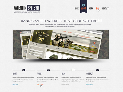
Own Site Final Version (full size screenshot inside)
This is it, after I followed on numerous feedback I ended up with a final version. Next step will be coding. Since I will code it myself, a few tweaks here and there shouldn't be a problem, so if you guys see something that needs to be fixed or improved, then tell me and I'll fix it.
What improvements I've done so far and why:
1) Got rid of that wavey ornament on the top of the header in homepage, since it had no particular role in the design, rather then being a mere decoration. Instead I placed it in the footer instead of a more heavier ornament (which was too heavy for such a minimalist design anyway). Credit to Luke Marohn for pointing that one out. This kid is not in Dribbble tho, he posted a review of my site on Concept Feedback along with dozen of good points.
If some of you guys have a Dribbble invite, please tell me and I will tell him to register in Dribbble and get drafted. This community would benefit big time from this player.
2). I reduced vertical spacings in order to fit the most important stuff on a 800px high monitor (thanks to Juan Bustamante from Concept Feedback). This resolution is among 50% of all users. Very good point.
3). In the About page I replaced a wavey ornament with asterisks to separate different sections of the page, just like they do in books of poetry.
4). Fixed stripey patterns and colors, thanks to Fares Farhan.
That's about it. Thanks everyone of participating, for feedback, for support and kind words that kept me motivated.
P.S.: Yeah, I know the blog needs to be done too, but that's for later.


