Alternative Vimeo app swipe gestures
My ideas on alternative swipe gestures in the Vimeo app that may make it easier to use.
-----------
I love watching videos on Vimeo. There’s so much great content there and it’s easy to get completely absorbed in it. In terms of viewing it though, I find the app difficult to use. There’s a few areas that I struggle with. One such area, and the topic of this shot, is the swipe actions you can take on a video in your feed.
The app uses short and long horizontal swipes both left and right to trigger actions of:
- Swipe right short: Like
- Swipe right long: Share
- Swipe left short: Watch Later
- Swipe left long: Watch Later and download of the video
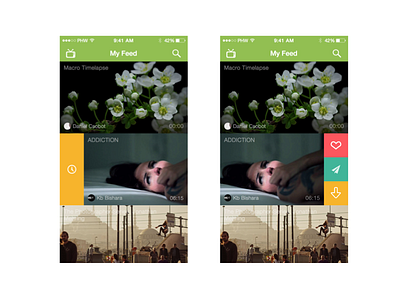
I find these quite difficult to use in practice. A possible enhancement is to split the actions out in a different way (see the full attachment).
- The main action one would take apart from just viewing the video is to add the video to your Watch Later list, so I've given this it’s own swipe action by itself as the swipe right.
- The remaining 3 actions are on the left swipe and work as a menu. Swiping opens the menu, then tap the action you want.
- The Vimeo app only uses icons to signify the actions and I can never quickly remember what they are. Labels would be useful and I've included these as long swipes. Check out the attachment to see.
I’ve also included the video name on the video tiles. I think it’s vital to show the video name as just relying on the placeholder screenshot doesn’t given enough information.

