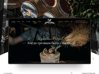
Leprechaun Restopub
The specialists of our company Promodex have developed the Leprechaun Restopub website, which is a pub specializing in alcohol and delicious food. The page design is made in dark colors. Doesn't distract the user's attention from getting to know the menu and the establishment itself. We took into account the main rules for placing elements on the page, but still preferred the tips of intuition. When we develop the design and arrange the important components on the pages, we always put ourselves in the user's shoes. After all, it often happens that the views of the site owner and the developers may not coincide.The golden rule in this situation is to imagine as if we ourselves are using the resource and in what places it would be convenient to see certain elements.
Behance: https://www.behance.net/gallery/126596377/Leprechaun-Restopub
Thanks for watching! Subscribe to me and like my works! This motivates me to design creatively!
