GG Brand Direction 1
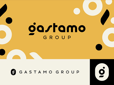
**A brand direction that didn't make the cut.**
We wanted to explore a retro wordmark, influenced by the 70's, as a nod to the client's affinity for this time period. The "g" mark also represents a table setting (glass, dish, utensils) created with simple basic shapes.