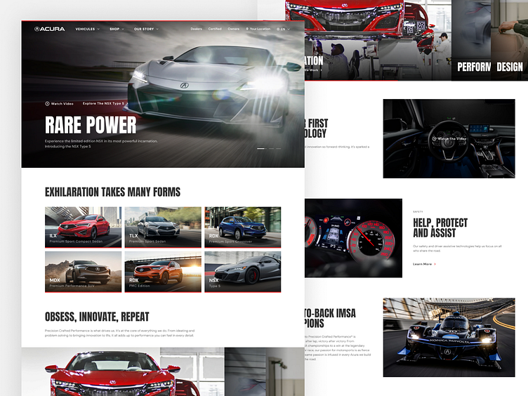
Acura Homepage Refresh
Full presentation: https://www.behance.net/gallery/126567741/Acura-Website-Refresh
As a personal project, I wanted to see what I could do with the current acura.com and acura.ca websites. Taking the content displayed on the Acura website and giving it a refreshed look.
In my visual redesign of Acura’s website, the emphasis was put on strong and bold typography to give it an aggressive look, to reflect Acura’s current design style and performance lines, as well as its motorsports presence. Focus was also put on large lifestyle images of their vehicules, to properly showcase their design and features in detail.
Made using Figma.
More by Alex Bedard View profile
Like
