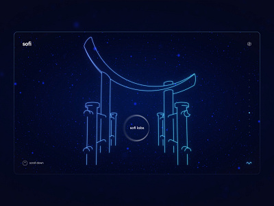
Sofi - Torri gate
Hey hey! 🎩 Today I am sharing one of the less significant parts of the sofi website. Torri gate that opens labs.
For better brand consistency and in order to save sofi's magical world we decided not to put any images or people on the website. So we had a problem when we had to show how labs look, which is essentially an image gallery. In order to do that, we designed the Torri gate as a link to the labs. In Japan, they are usually found at the entrances of their sacred shrines, so we can say that in our case sofi labs are our shrine, and therefore we have our gate!
In the second image, you can see how the design evolved from a classic gate to a more soft, organic direction with a moon shape on top. In the end, we decided to light it from the top and got an even more magical look. Also, there is a guide for you all on how to create this glowing neon effect in Figma. If you use it please let me know, I would love to see other use cases.
Sofi website is currently in dev mode, can't wait to be published! 🌔

