Automatic Material

Recently got to spend some time with Android L and the new Material design spec. Gotta say, I'm pretty impressed. Android has come a long way since it's early days. Between Windows 8 (Metro), Android Material, and iOS 7, the mobile design landscape is starting to feel mature — but more on that another day...
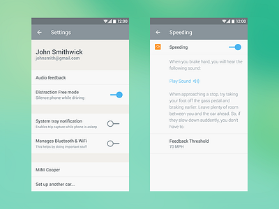
Now that Automatic 2.0 has been released, I'm turning my attention to the Android app. First place I'm starting is with the Settings view. Given its low profile in the app, and that it contains non-flashy, lesser used functionality & content, it's a perfect candidate for scooping up some of the new Material design language, while letting some of the other more bespoke portions of the app stay, well, "bespoke".
These are some of my first passes with the new style. The craziest thing happening right now, are those switch controls. I kinda love them, but they're super different from anything else out there right now. Also, Material has a very open and airy grid, especially when it comes to vertical spacing. I think this will be a win overall for tapability, but it still takes some getting used to.
Thoughts?