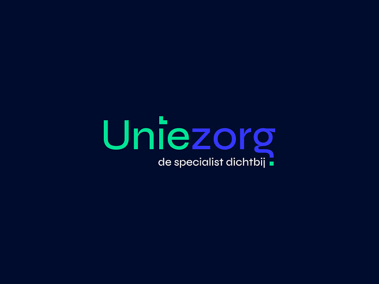
Logo 24 - Uniezorg
Uniezorg is a Dutch healthcare collective. The organization is a collection of multiple healthcare areas. Their goal is to treat people who aren't always able to go to the hospital. Uniezorg's appropriate payoff is: the specialist nearby.
I was able to create a minimalistic logo that consists of unique colors and a recognizable font. The dot above the 'i' suggests a cross like we are used to see when it comes to healthcare symbols. The dot below the 'g' finishes this symbol. It represents the coherence between 'Unie' and 'Zorg'.
Happy with the result, big fan of those colors!
More by Ben van den Bosch View profile
Like
