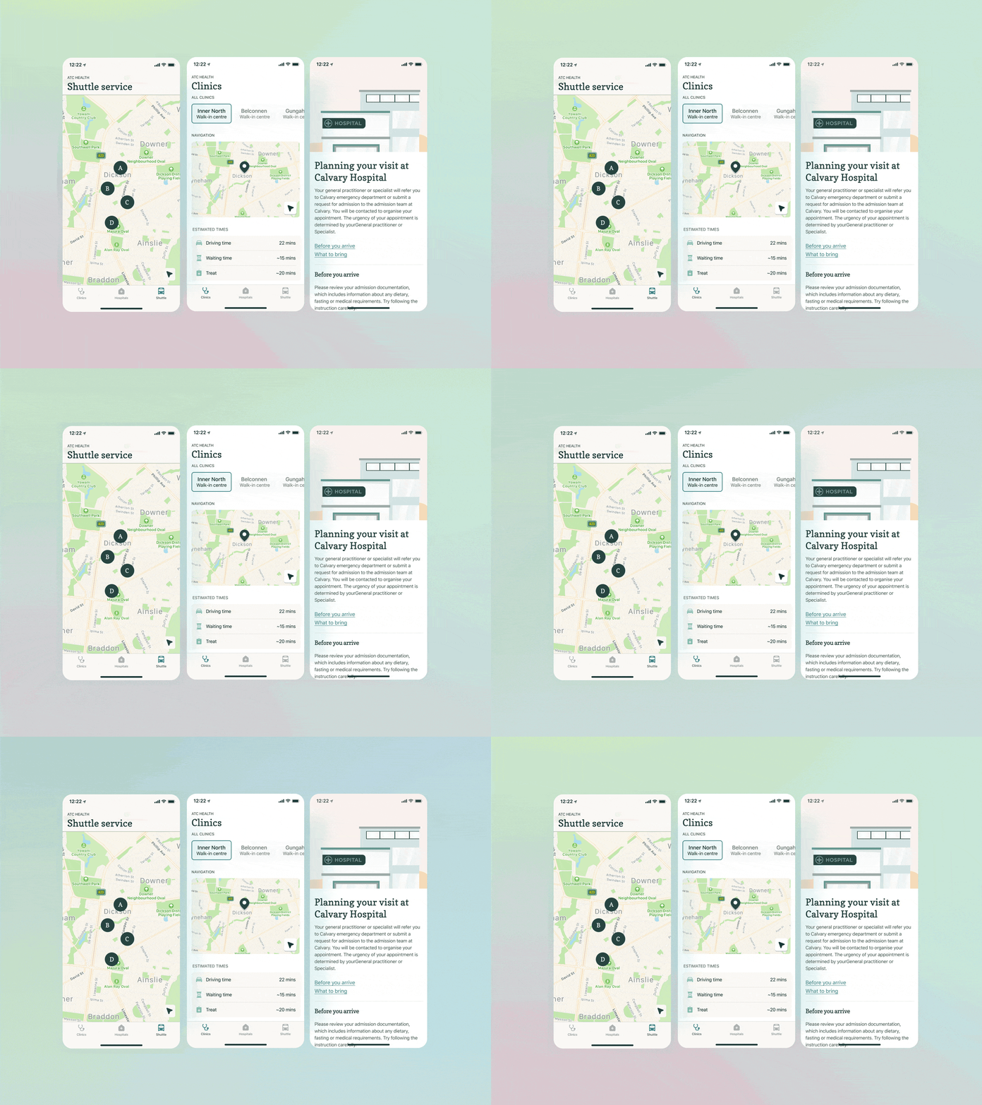
Healthcare app redesign 👩🏻⚕️
Hi Dribbble, long time no see 👋
I had fun improving the user experience and interface of the ATC health app. https://apps.apple.com/au/app/act-health/id1436560685
The app gives you detailed information about waiting times, shuttle transportation and articles on how to prepare for yours hospital stay. The app supports clinics and hospitals located in Canberra, Australia.
I noticed there were a three main friction points with the app. The first thing was the navigation, many taps were needed before getting to the right screen. Secondly the branding didn’t seem to match the way people perceive of hospitals and healthcare. Lastly, the App Store reviews revealed that the waiting and treatment times weren't accurate.
This is what changed with the new design: ✅ Removed a feedback tab. Integrating the feedback feature into the articles bottom section in order to make it sit more contextually within the app. ✅ New colours, for a more modern and trustworthy look & feel. ✅ Split Hospitals and clinics tabs, as the information here is different.
Hope you enjoy! ✌️ Sandy
