The Nuclear Pirate
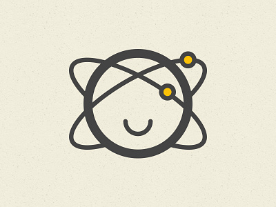
Logo design for a client. The client is working on a website to educate citizens on nuclear energy.
What I needed the icon to do:
- Look friendly;
- Be suitable for the target audience;
- Stay clear of the aggressive-looking nuclear energy icons.
It wasn’t easy to stay away from the ‘DANGER!’-signs, it makes everything looks so aggressive! The final icon looks really friendly, and suits the design of the website (WIP) well. Funny detail: I enjoy how the face in combination with the energy ring looks a bit like a pirate. Arrr!
More by Jantine Zandbergen View profile
Like
