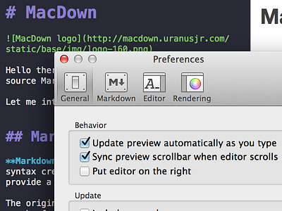
MacDown Preferences Icons
These are the new preferences icons for MacDown the new Markdown Editor.
It wasn't easy to convince Tzu-ping Chung (the creator of MacDown) that these new Icons look better than the old OS default ones. But now they will be published with the next update. ;)
Btw, don't forget to check out the high res retina image!
What do you think, should apps stick to the default OS style? Or imitate the icon style at least?
I think no, because apps stand for itself. Sure they are integrated into the OS, but that doesn't mean to stick to the style. Take a look to all these great apps out there (Coda, Sketch, Pixelmator, even Pages, iWork and Numbers and many many many more). Most of them are using their own Icons and UI styles. But they all fit into the system. I think using own Icons doesn't means it's inconsequent or something like this. It's more to stand out of the crowd and keep an own style.
Also I really don't like the OS default Icons. They are old and fuzzy. Hope Apple's Designers find some time to redesign them with Yosemite…
UPDATE: My Icons finally made it into the release build. Update to Version 0.2 now! ;)
