UX Pet Peeve

If the rumors are true–and they appear to be–you iPhone users are about to feel the frustrations that we large screen users have been feeling.
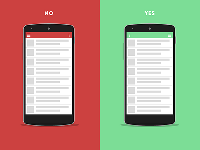
I've always found the placement of the menu in the top left portion of the screen to be frustrating. It is hard to reach even for a guy like me with big hands. Thusly, I have been designing my sites with the menu button the right side of the screen for a while now because it's much easier to tap.
HOWEVER! As I made this thing I really started to question a lot of the design patterns that we have come to accept since smartphones have become the norm in our lives. Maybe these kinds of elements are better placed fixed to the bottom of the screen?
We are so early in the life of interaction design for mobile devices and I think this kind of stuff is worth nipping in the bud before it's too late. Especially, as the forms of our devices change.
I guess this is meant to be a converstation starter.
What are your thoughts? Rebounds?