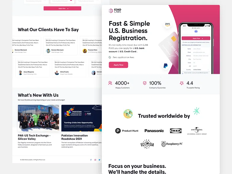
Landing Page: EjadPlus
Hello Dribbblers,
Presenting a Modern and Trending Landing page Design for Ejad Plus. I tried to make it look clean with more empty space and tried to use some bright colors for the design to make it look interesting.
Please share your feedback about color choice and placement of the elements.
Press "L" and enjoy the shot.
_______
Have a project to discuss? Do not hesitate to say hey at:
More by Uzair Ahmed View profile
Like
