Matchmaking's Desing System | Colors

Part of the Matchmaking's Fundations.
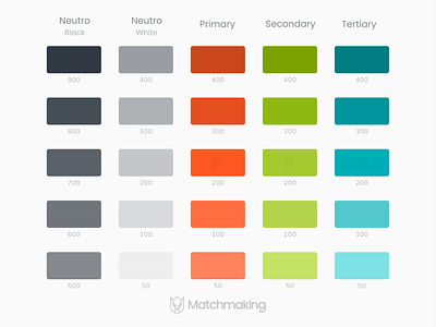
Each color give personality and a voice at the project and the brand.
The palette was designed for be use on light and dark themes.
The orange is the principal color. Green is used as emphasis color and aqua for secondary texts.