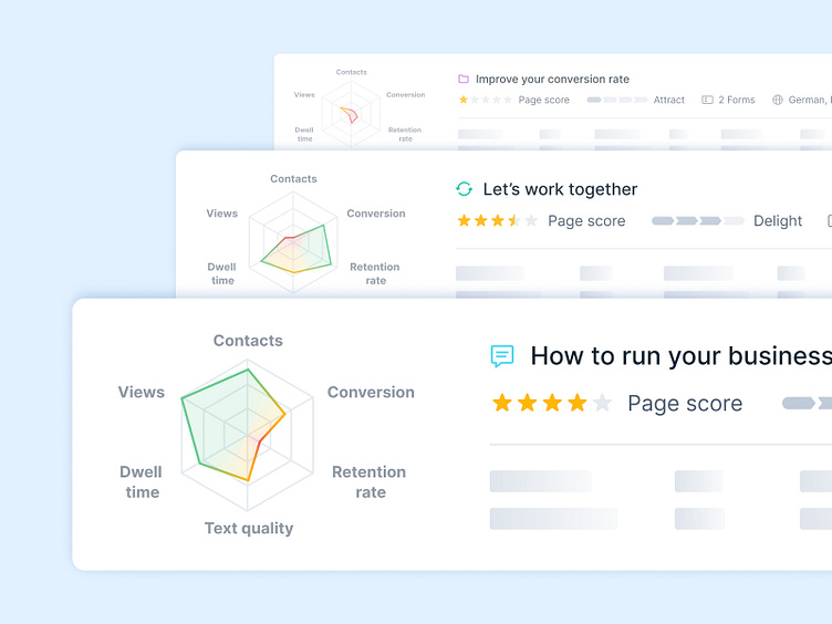
Spider diagram vs. heat map
Funny insights from our team: Our ux & ui designer Nick created this spider diagram for a content marketing platform to show the user how different sites are performing.
The spider diagram is combinated with a heat map and the first reaction from our developer Sven was: „Haha who should implement that? Have you seen anything like this before? No? Why not? Because it’s too complicated! Do it yourself!”
And Nick’s reaction? „No problem. Here it is.” Via codepen.io Nick coded the base.
Of course, Nick did not the main development part! In the end, Sven mastered all the obstacles successfully. But this situation show’s really good what makes us special: Almost all developers have design experience, and some of our designers have development experience. In this way we can better put ourselves in the other person’s shoes and improve our work.
What about you? Do you also have skills that go beyond your expertise? And what do you think about our spider-heatmap-diagram? Tell us in the comments!
— überdosis ・ Your hands-on team for lovely digital products. Visit us at ueberdosis.io and feel free to contact us.
Do you have a specific project or a rough idea? Both are great! We’re specialists in building human-centered systems and you know your customers and industry best. If we put our knowledge together, we’re able to create meaningful digital products. Drop us a line and tell us your idea.
